


Easy Onboarding
Context
Seaya is a national booking platform in Azerbaijan (SeaBreeze). The team wanted to move landlord/property registration online and reduce the operational load on Support.
Problem
The first MVP was a long registration form. Even though it worked, users dropped off heavily during completion. The goal was to make registration feel simple and trustworthy for a broad audience, including less tech-savvy users.
My Role
Product Designer (UX + UI). I joined after the UI framework had already been chosen (Minimal UI + MUI). To speed up delivery and prototyping, I created a component system and refined the existing style guide.
Constraints
- Existing UI framework and component patterns were already in place.
- Local market specifics (address formats, legal statuses, tax responsibilities).
- Need to reduce errors and Support involvement without overloading users.
Approach
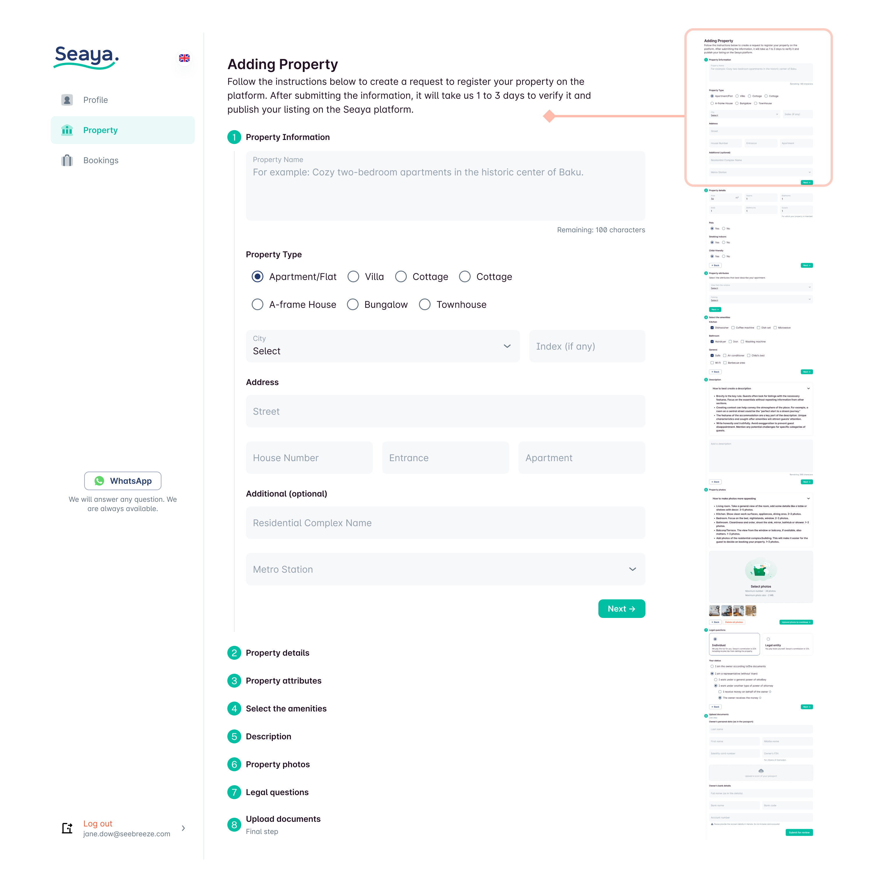
We created a registration form using Minimal.cc components and rolled it out, figuring out which fields we could skip for the future onboarding wizard.
1. Ship an MVP and learn
We first shipped a form-based MVP to start online registration and understand which fields were truly required. This also helped identify where users dropped off and which inputs could be postponed.
2. Replace “form fatigue” with a conversational wizard
The core design shift: from a dense form → to a step-by-step wizard that feels like answering simple questions.
Key principles:
- Ask for a small number of inputs per step
- Use plain language instead of legal/technical phrasing
- Allow save and exit at any time
- Make it hard to make mistakes (structured selections, guided inputs)
- Let users go back and correct decisions safely
Solution
The wizard is super user-friendly. We walk you through everything from start to finish until you publish on the platform.
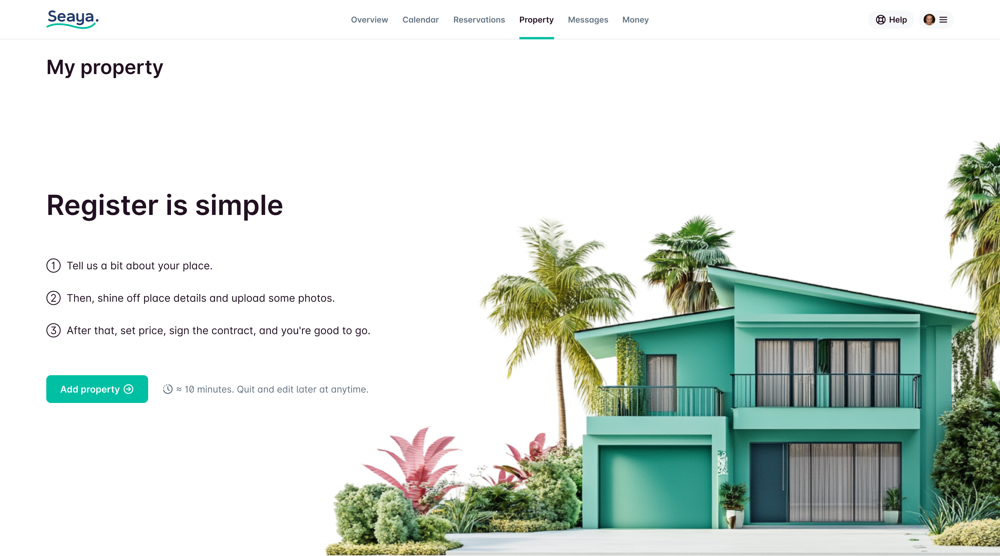
Instead of a boring machine full of buttons and forms, the wizard talks to you in plain, easy-to-understand language.
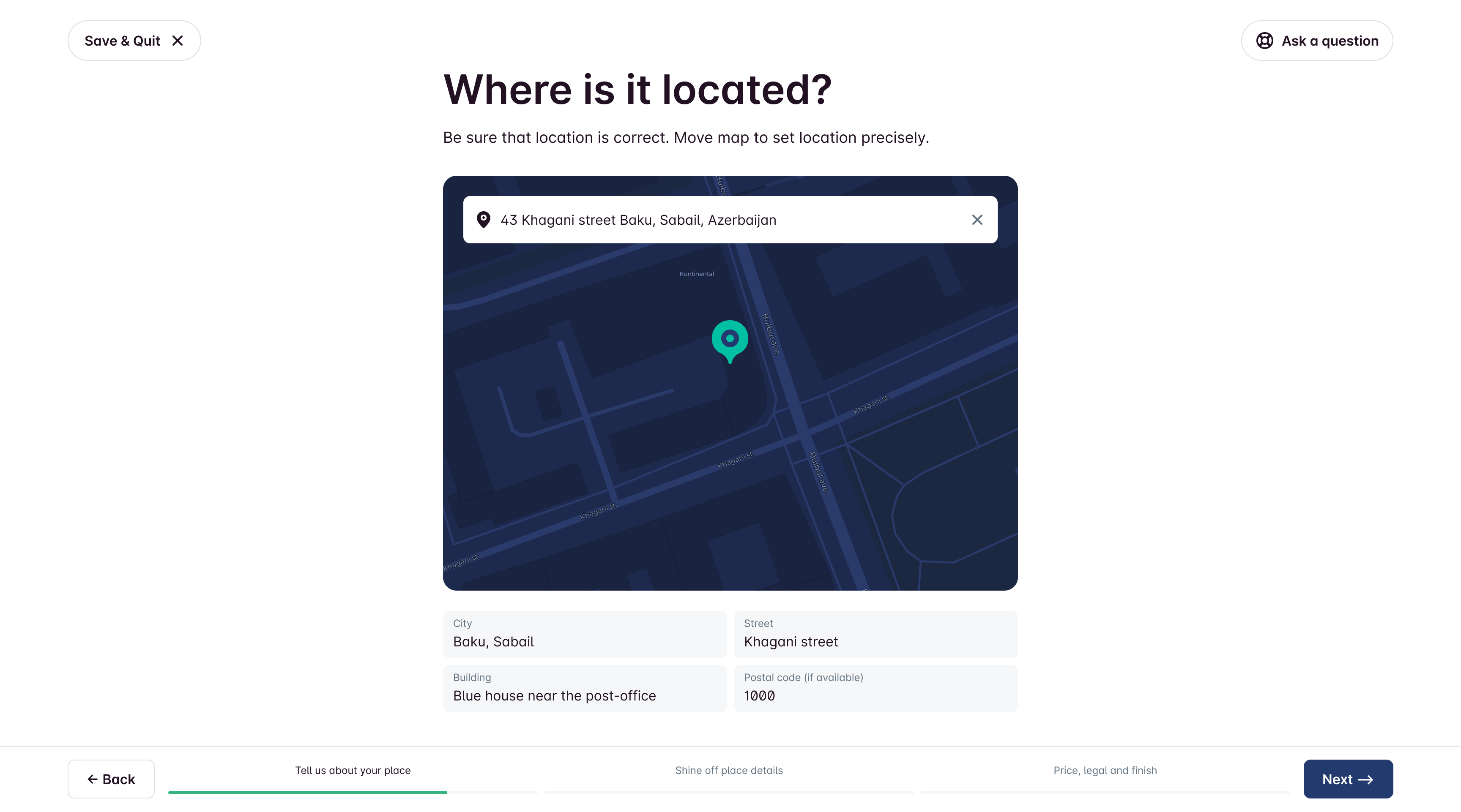
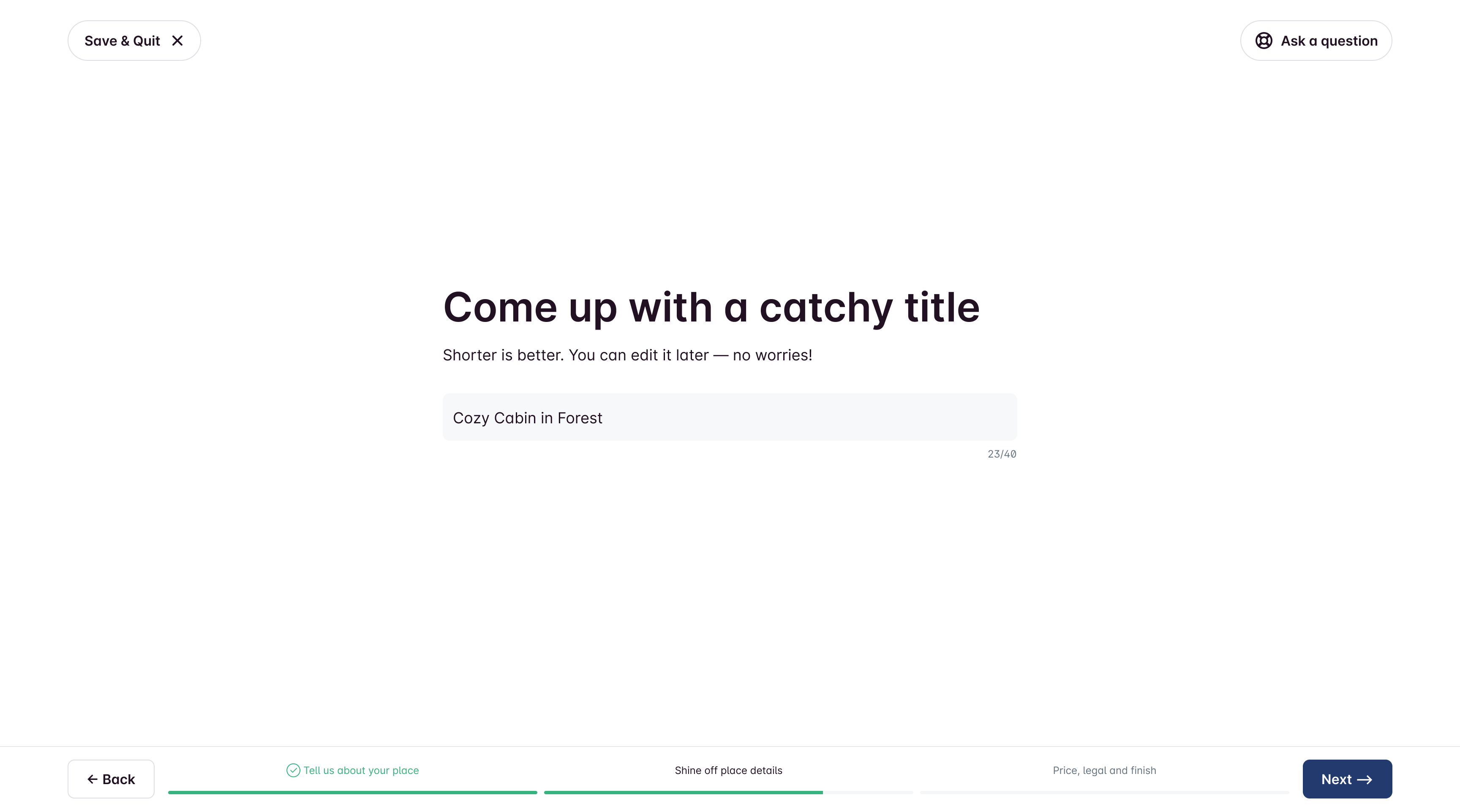
Part 1. About the place.
It feels more like answering questions than dealing with tricky forms. Plus, you can leave anytime and save your progress. If you accidentally pick the wrong answer, no worries—you can go back to the last question!
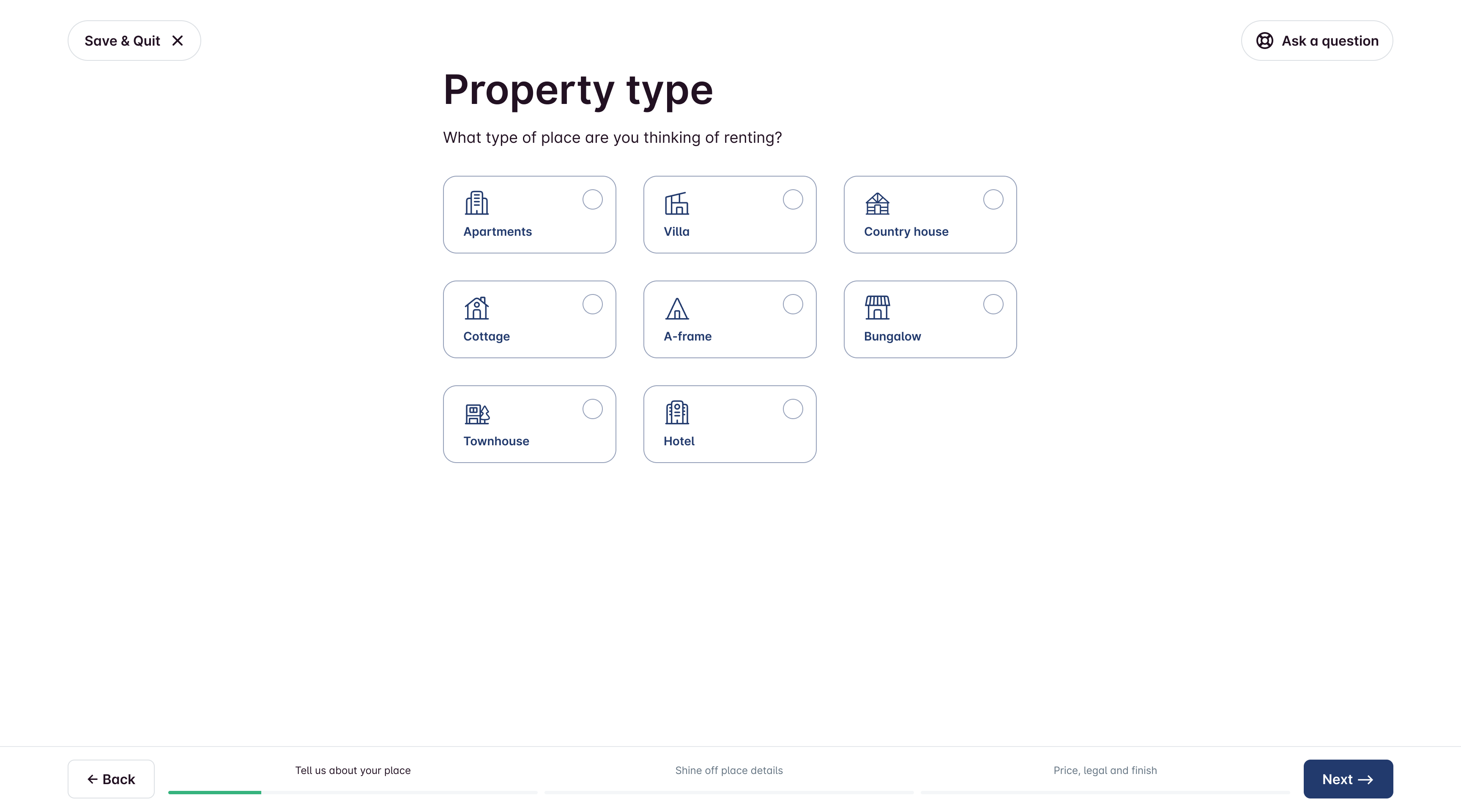
Each part of the wizard contains a small number of questions to simplify the completion process and avoid overwhelming the user with unnecessary information.
Address is selected from a database to prevent mistakes.
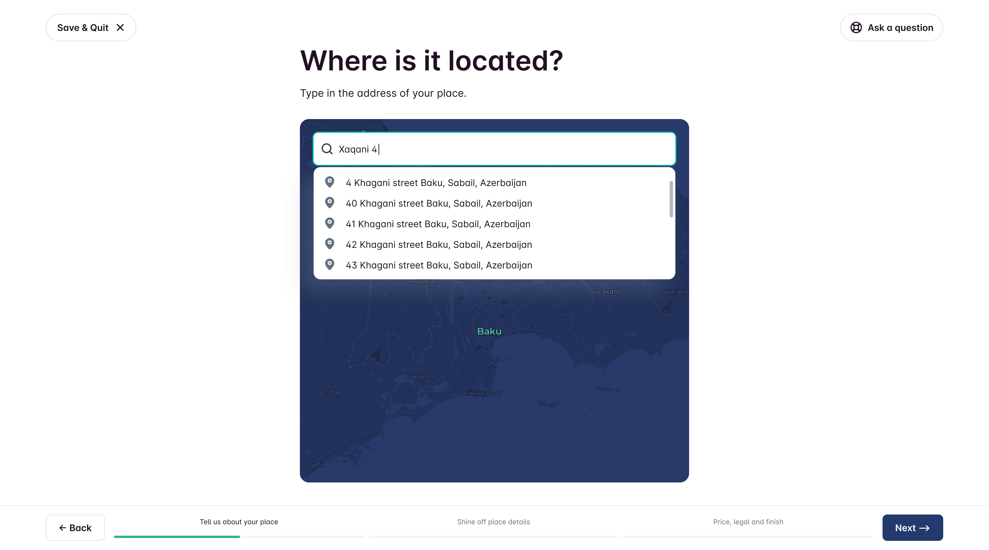
However, due to local peculiarities, instead of the house number, you can also write it in words.
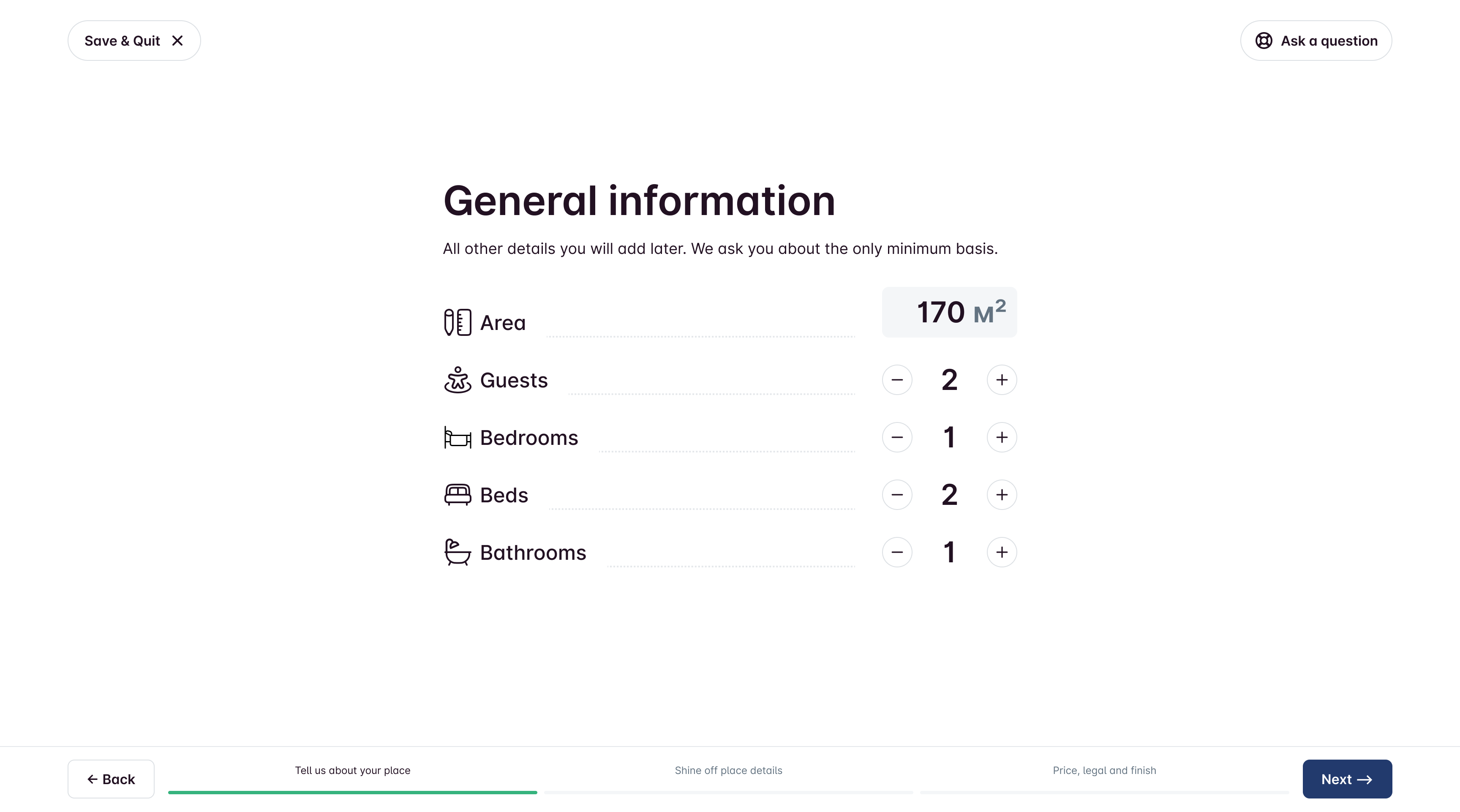
Part 2. Place details.
Button-driven UI for number-heavy inputs to minimize keyboard usage.
Amenities selection optimized for fast completion.
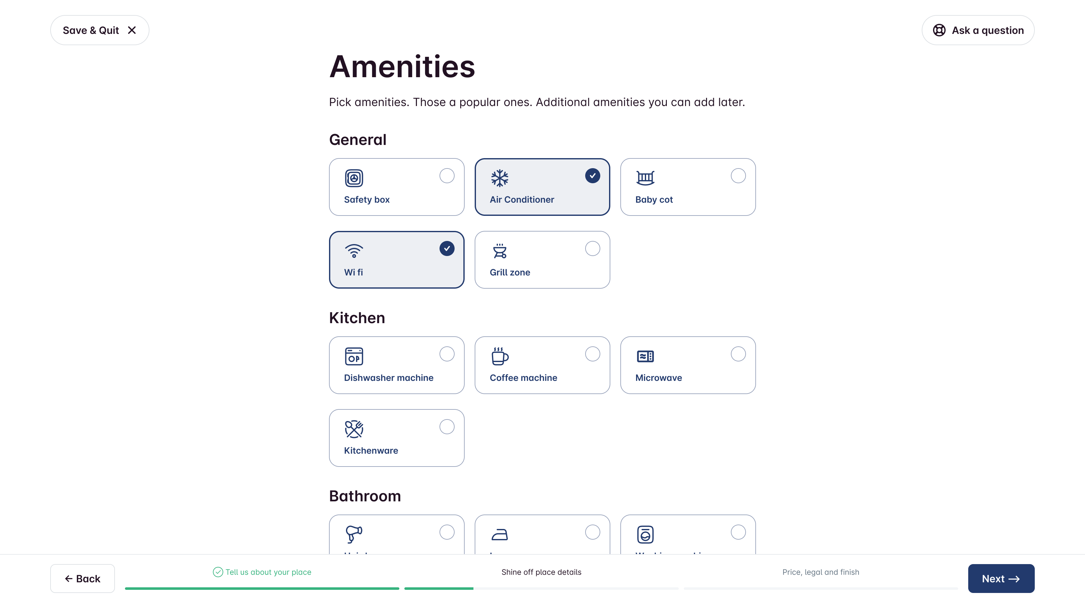
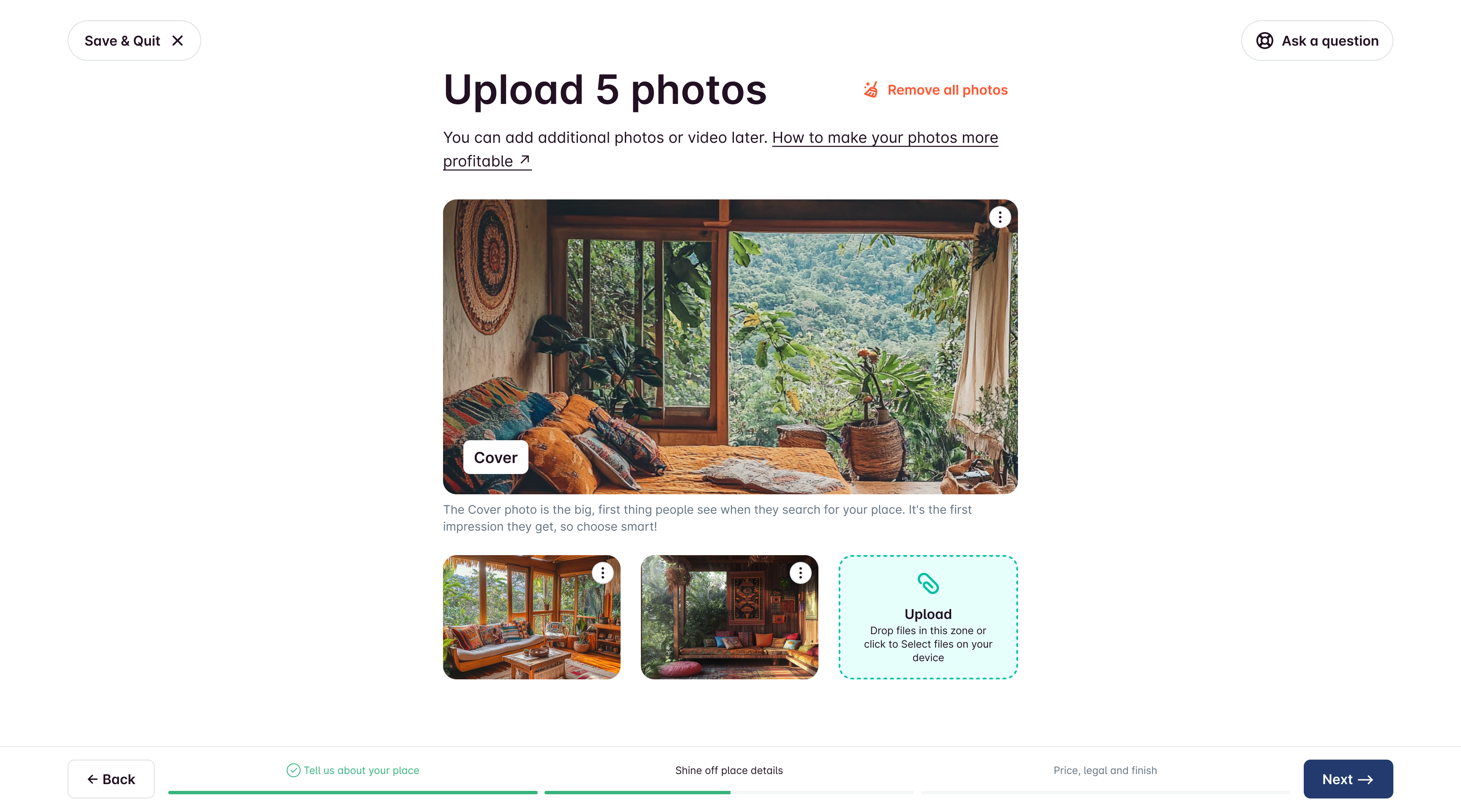
Photo upload with lightweight guidance (make photos more effective).
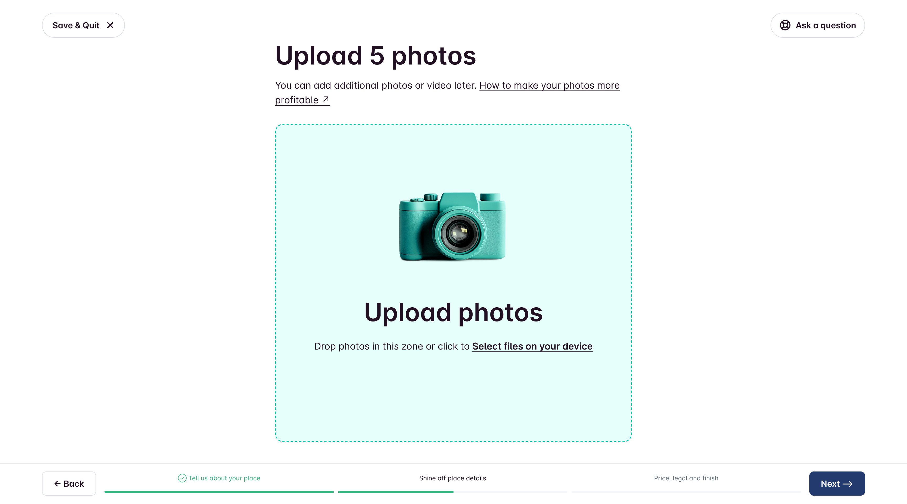
Reorder/delete/feature photos easily. Feel free to switch things up! You can rearrange the order, delete any photos you don’t want, or even make one photo the star of the show by putting it first. It's super easy to do!
Auto-title logic for hotels (avoid duplicate “Hotel” in names). Property names on our platform can be the same, but if you pick Hotel as the property type in the first step, we’ll drop the word Hotel from the name if it’s there. This helps keep titles unique!
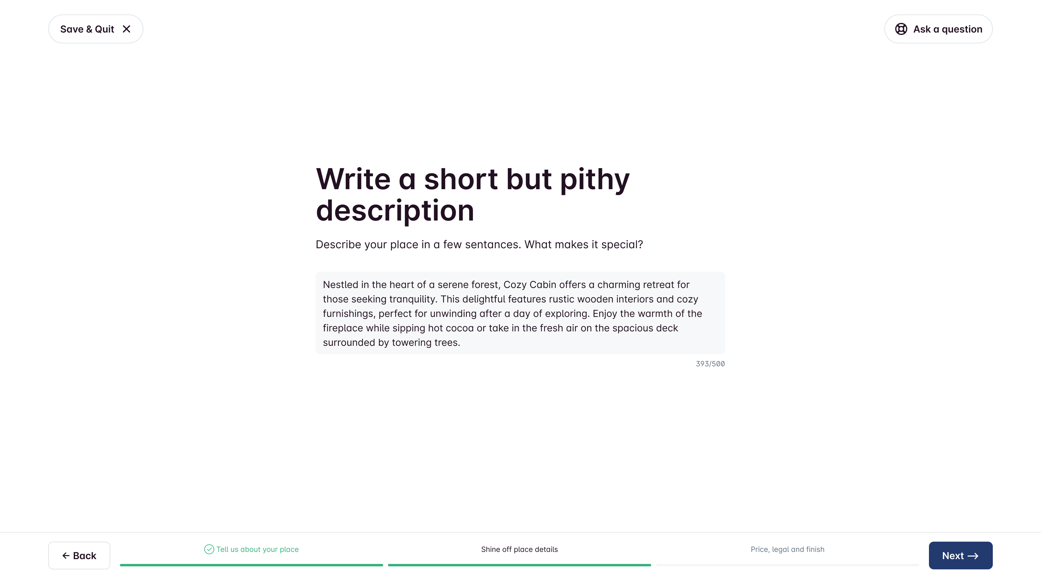
We were thinking about adding AI assistant to this page to help users with writing, but we decided to scrap that idea for the MVP.
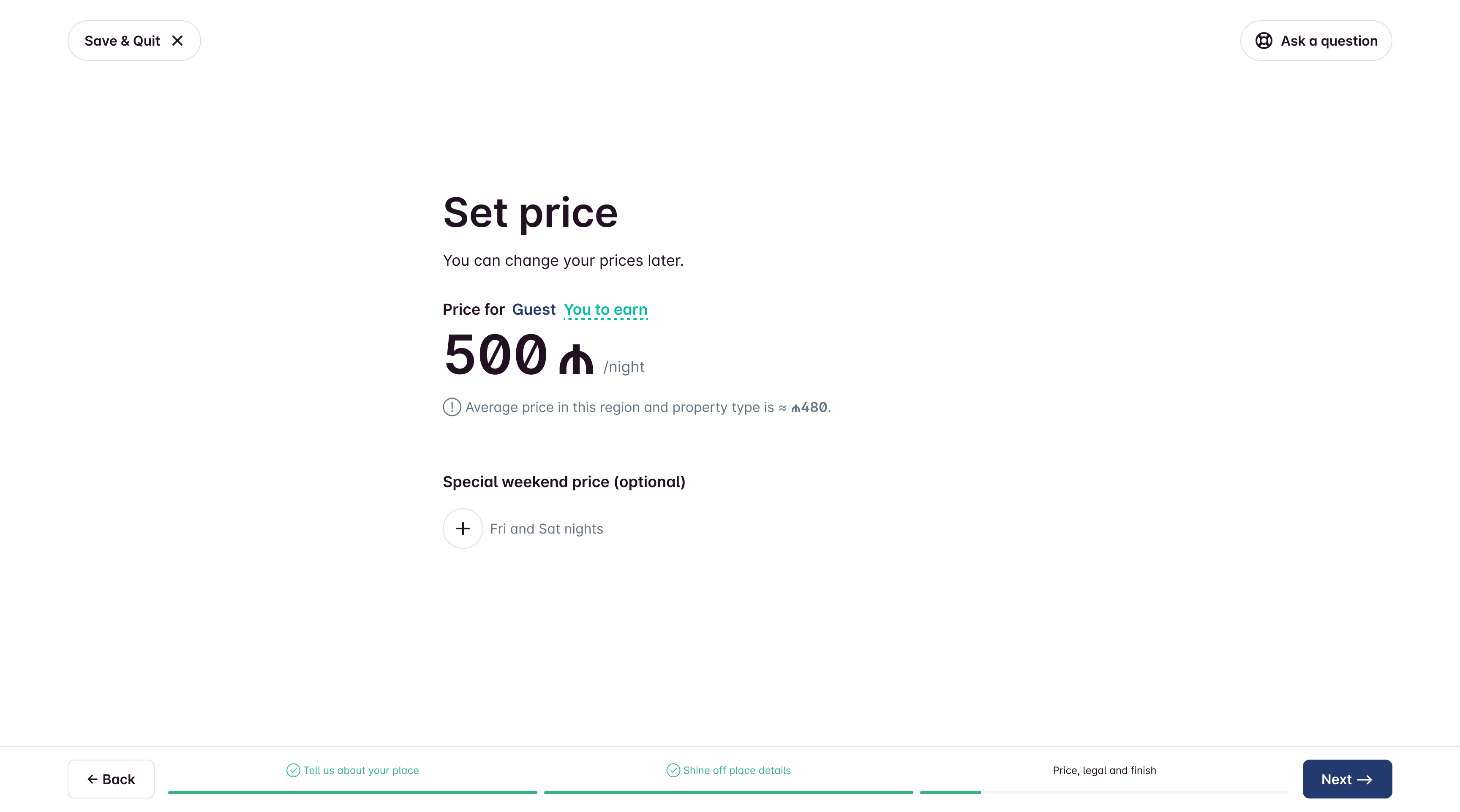
Part 3. Price.
The owner can choose how much to charge for a night's stay. They can set the price that guests see or the amount they actually want to earn. Plus, they can set higher prices for weekends, which is common in tourist spots.
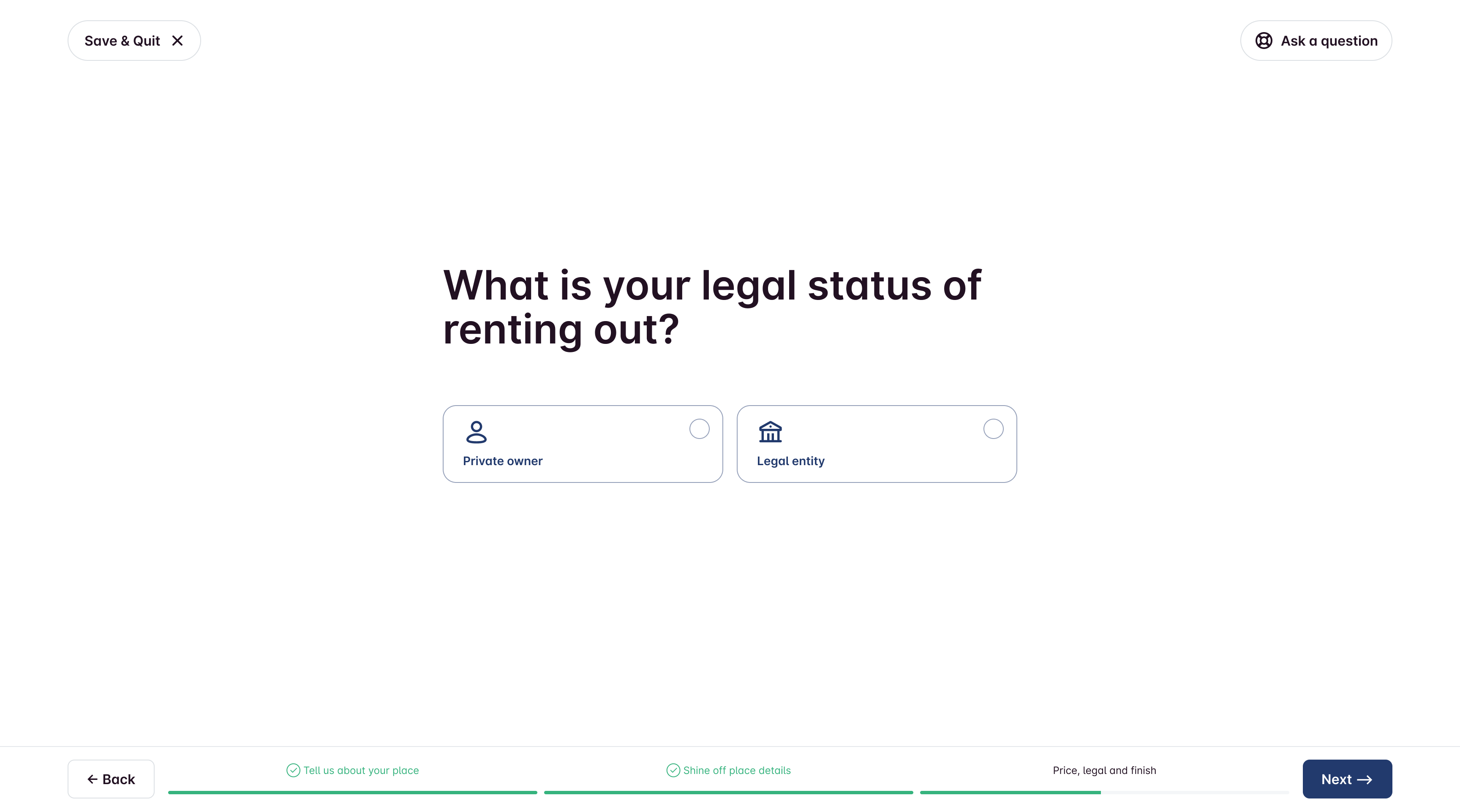
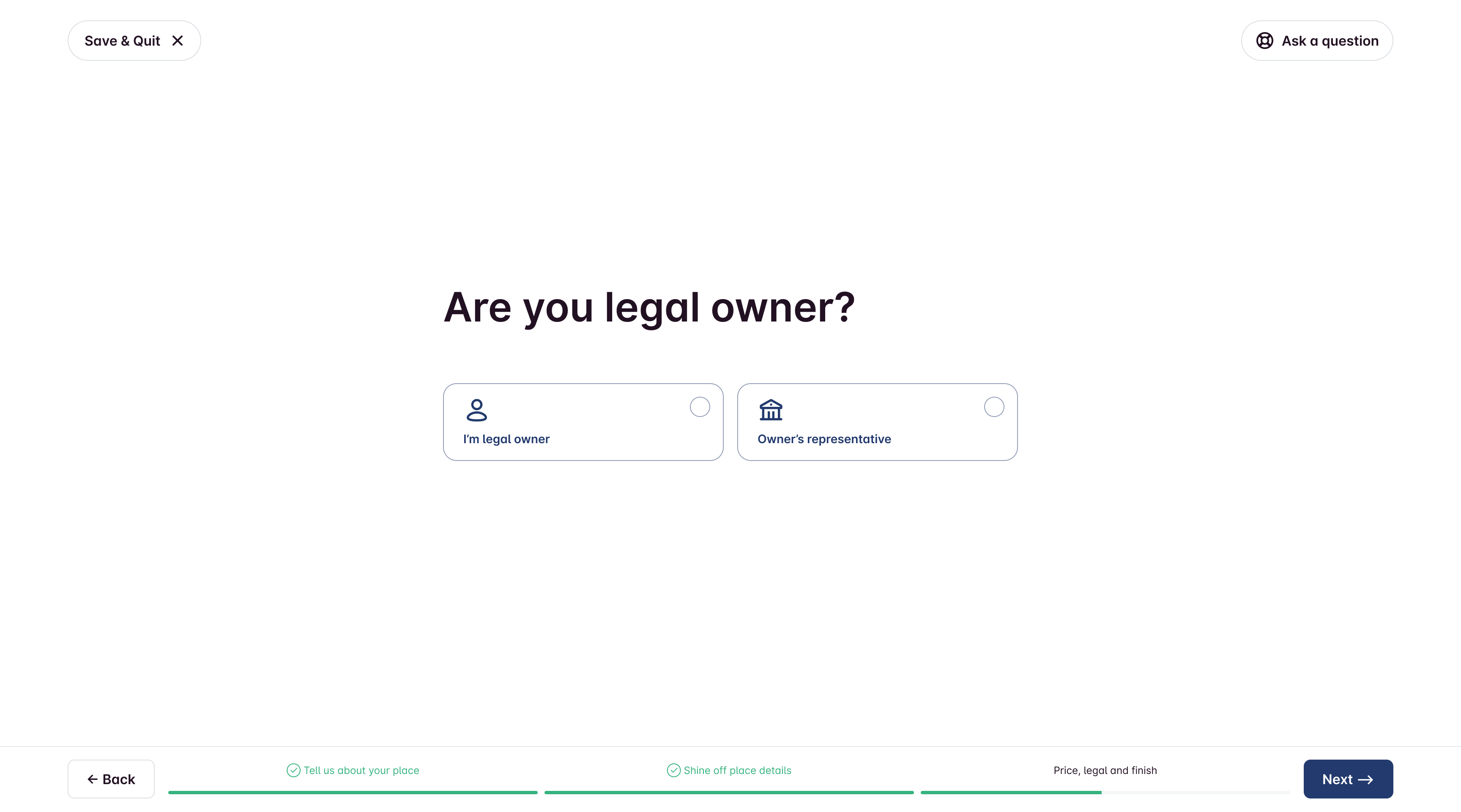
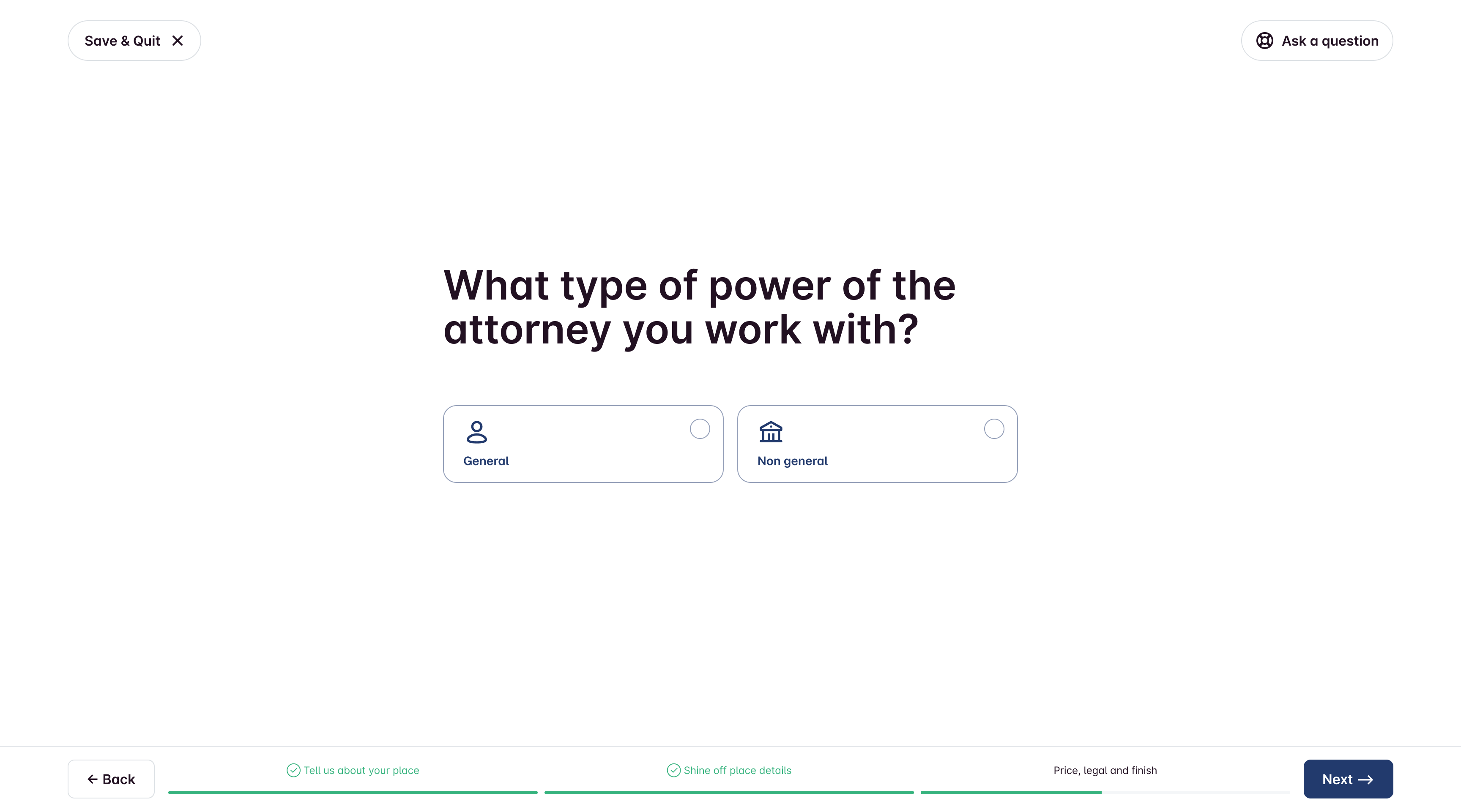
Part 4. Legal.
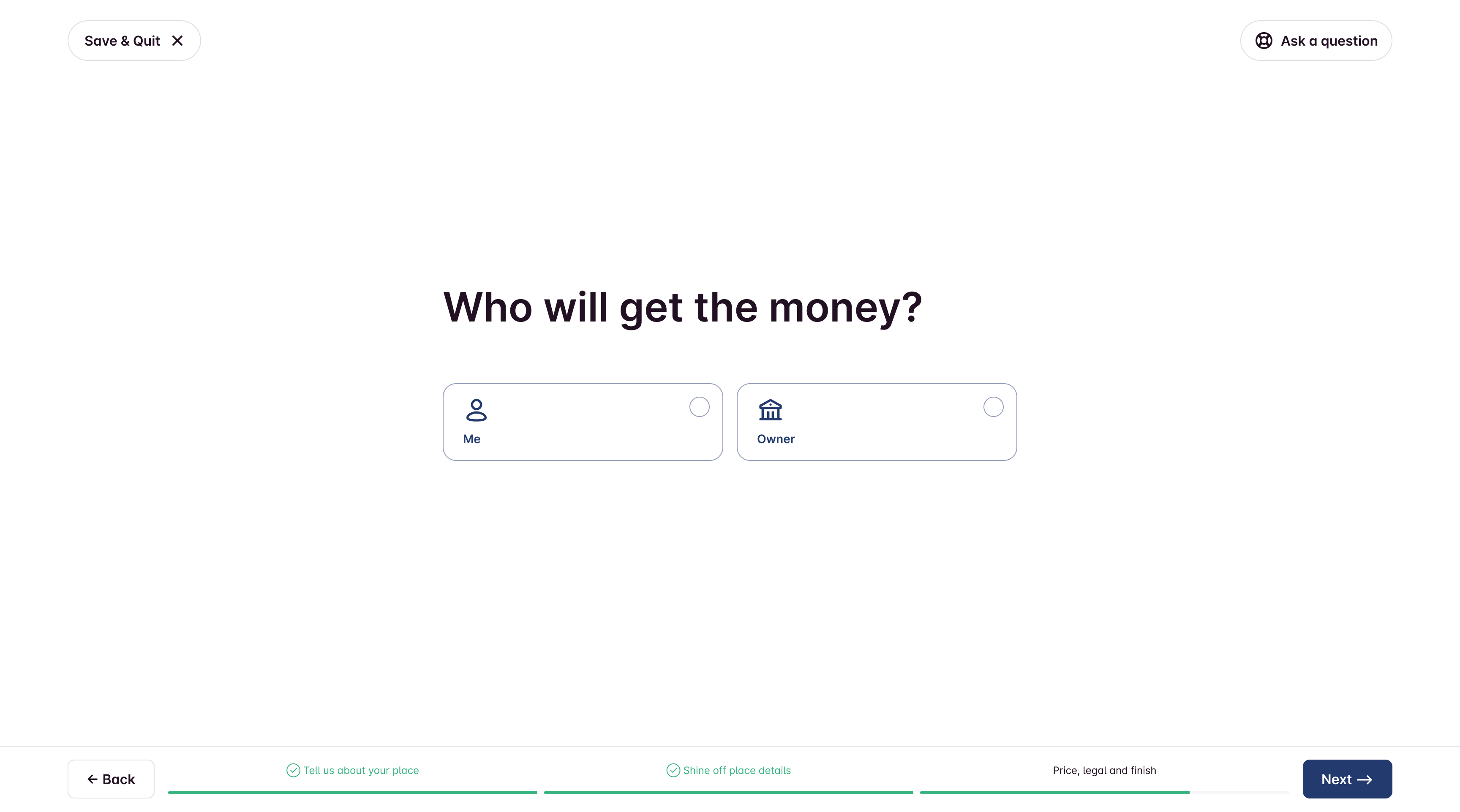
Since many of landlords own or manage multiple properties, I set up 2 default document presets (the ones we use the most) and added the option to create your own. This way, when you're registering a new property, you won't have to start from beginning again.
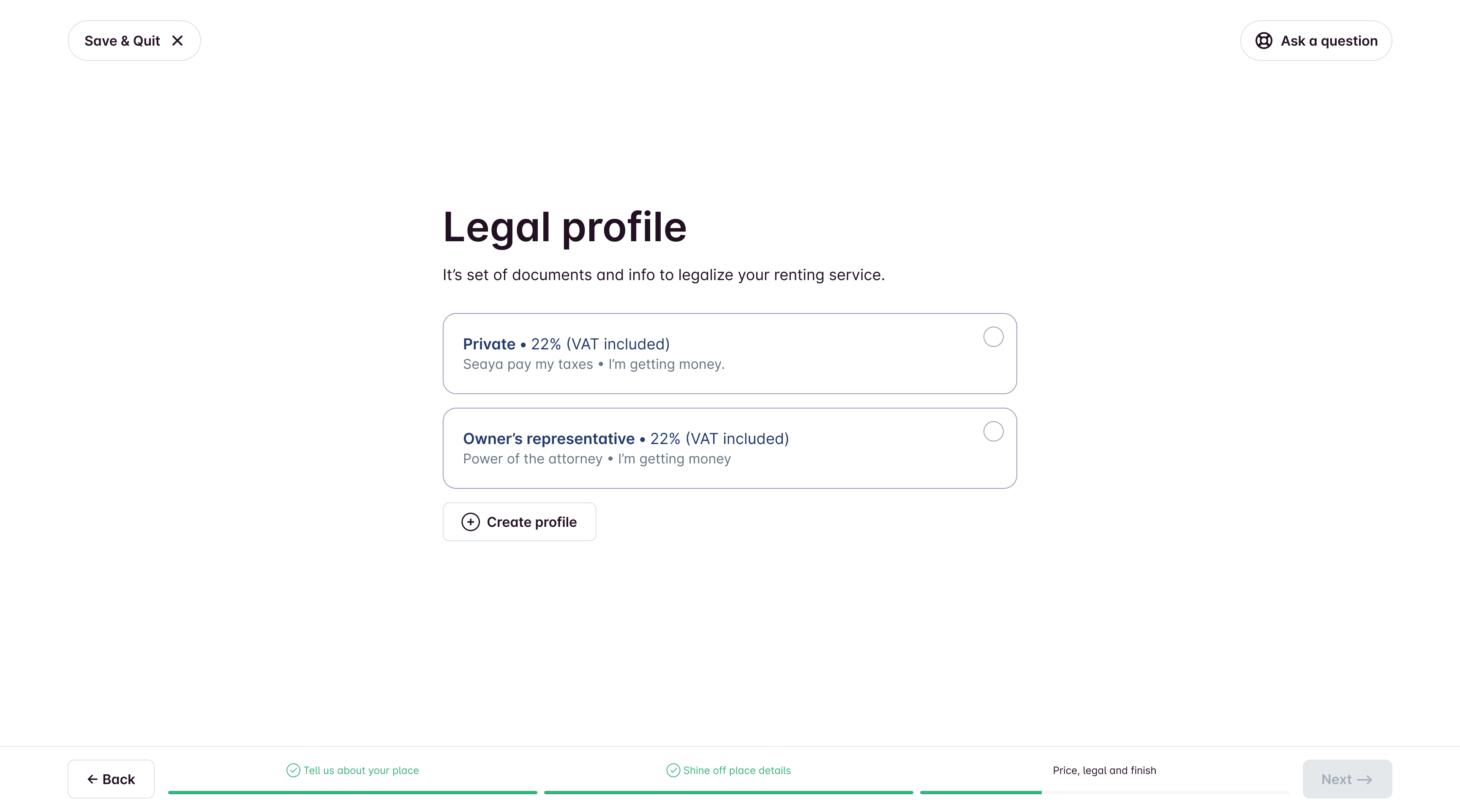
Here the process of creating Legal profile from the scratch. Kept legal setup as a guided questionnaire, not a legal form wall. It might seem like a drag, but it’s a crucial step in the onboarding process because of Azerbaijan's unique legal stuff.
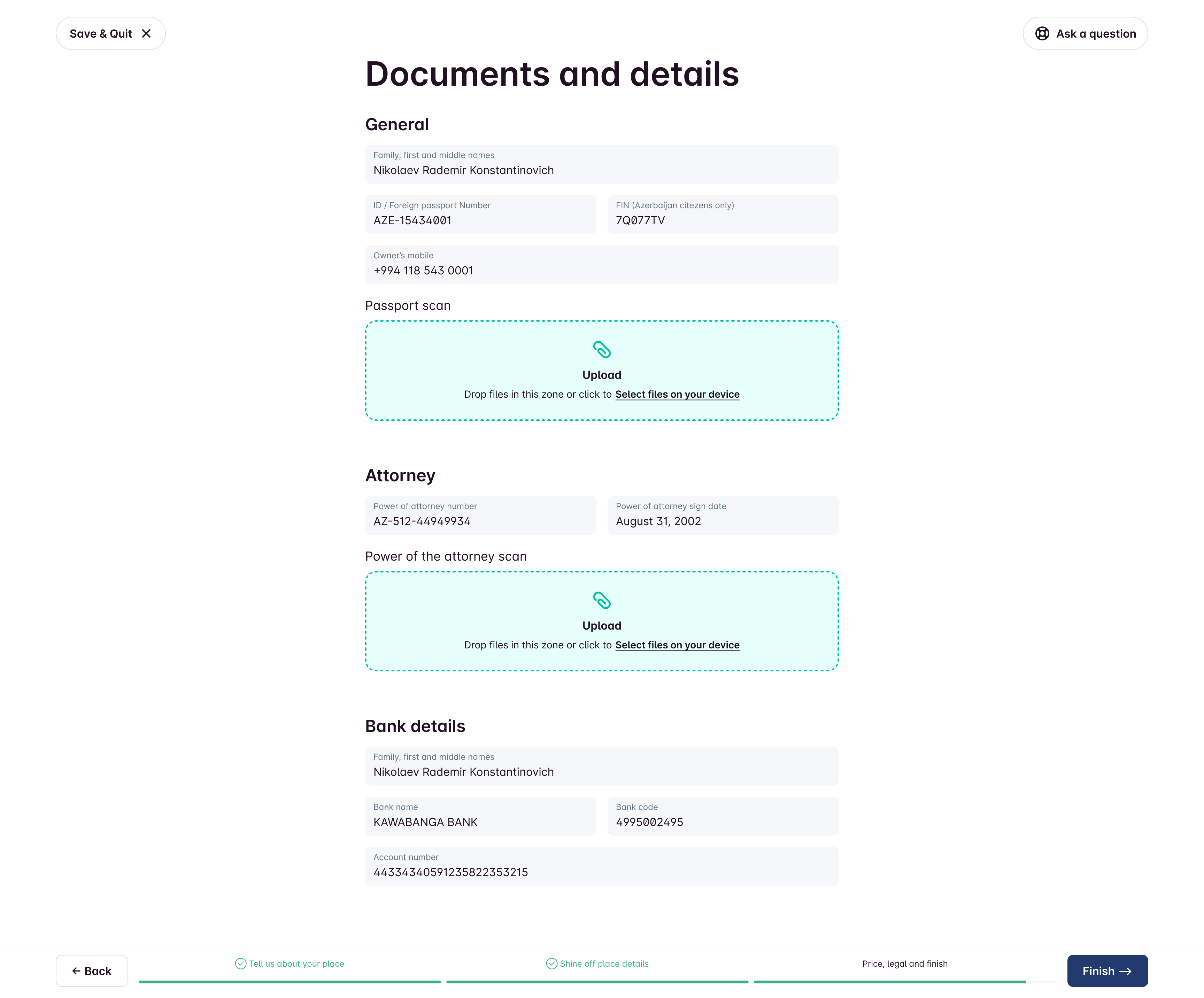
Part 5. Final touch.
We’ve got a straightforward form based on a quick questionnaire. Once you fill it out, it’ll automatically whip up a contract between you and Seaya that you’ll need to sign to get your listing up on the platform. Just add your info, upload the needed scans, and hit Finish!
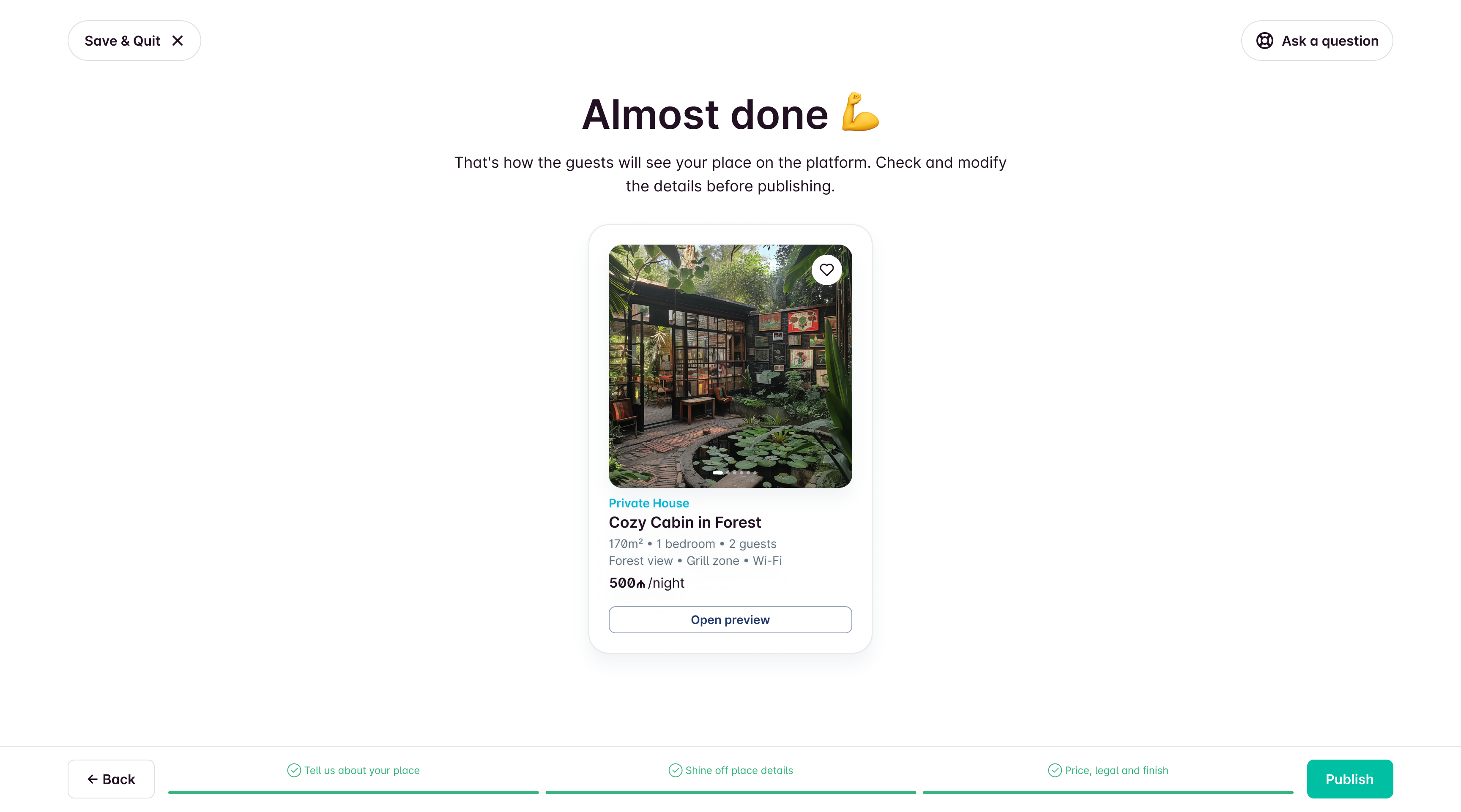
Finish
After submission, the listing goes to review/publication. Support can step in if corrections are needed. Users still need to sign a contract and set availability dates before guests can book.
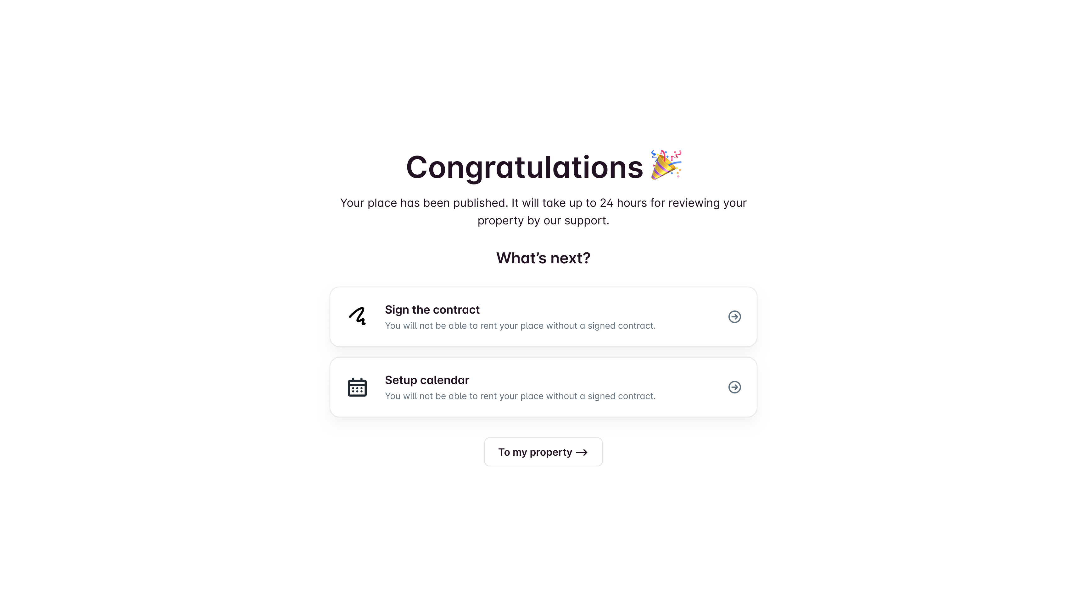
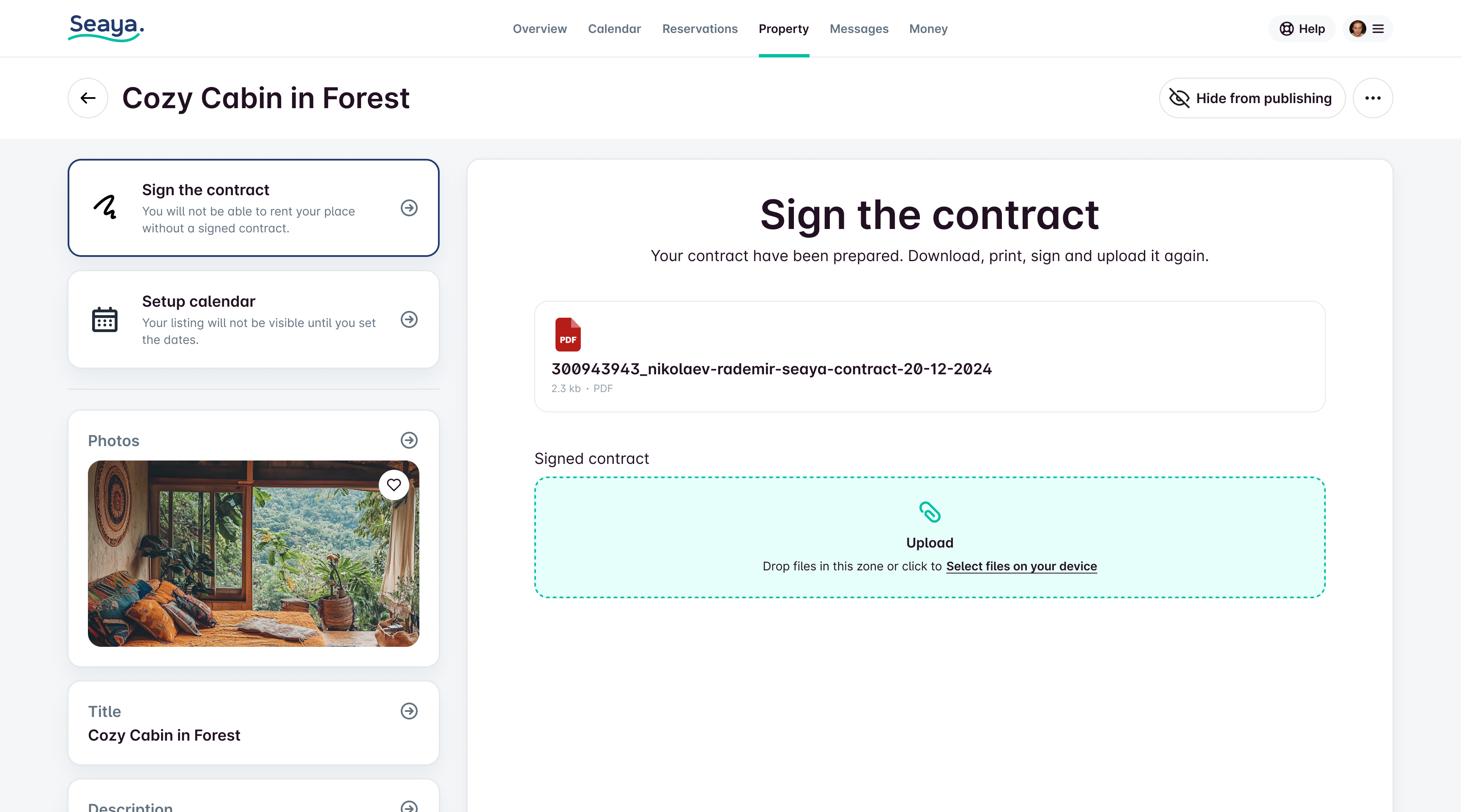
The contract is generated automatically, and the user only needs to sign it and upload it to the platform. This completes the registration process.
Results
15 min
The onboarding time averaged 15 minutes, instead of 40 in the previous MVP implementation.
24h
Publication time. Thanks to the automation of contract preparation. vs. days before.
+20%
Registration completion. simplifying onboarding and moving legal-heavy steps out of the critical path.
What made the biggest difference
- Moving heavy/legal steps out of the “momentum-killing” parts of the flow.
- Breaking the process into small steps with clear language.
- Making inputs harder to mess up (structured address selection, guided questions).
- Presets for repetitive legal/document work.
What I would do next (if continuing)
- Instrument step-level drop-offs and iterate on the worst steps first.
- Add lightweight inline help (examples, microcopy, error prevention).
- Consider AI-assisted content generation where it creates real user value (e.g., listing descriptions), with strict guardrails and clear user control.

Easy Onboarding
Context
Seaya is a national booking platform in Azerbaijan (SeaBreeze). The team wanted to move landlord/property registration online and reduce the operational load on Support.
Problem
The first MVP was a long registration form. Even though it worked, users dropped off heavily during completion. The goal was to make registration feel simple and trustworthy for a broad audience, including less tech-savvy users.
My Role
Product Designer (UX + UI). I joined after the UI framework had already been chosen (Minimal UI + MUI). To speed up delivery and prototyping, I created a component system and refined the existing style guide.
Constraints
- Existing UI framework and component patterns were already in place.
- Local market specifics (address formats, legal statuses, tax responsibilities).
- Need to reduce errors and Support involvement without overloading users.
Approach
We created a registration form using Minimal.cc components and rolled it out, figuring out which fields we could skip for the future onboarding wizard.
1. Ship an MVP and learn
We first shipped a form-based MVP to start online registration and understand which fields were truly required. This also helped identify where users dropped off and which inputs could be postponed.
2. Replace “form fatigue” with a conversational wizard
The core design shift: from a dense form → to a step-by-step wizard that feels like answering simple questions.
Key principles:
- Ask for a small number of inputs per step
- Use plain language instead of legal/technical phrasing
- Allow save and exit at any time
- Make it hard to make mistakes (structured selections, guided inputs)
- Let users go back and correct decisions safely
Solution
The wizard is super user-friendly. We walk you through everything from start to finish until you publish on the platform.
Instead of a boring machine full of buttons and forms, the wizard talks to you in plain, easy-to-understand language.
Part 1. About the place.
It feels more like answering questions than dealing with tricky forms. Plus, you can leave anytime and save your progress. If you accidentally pick the wrong answer, no worries—you can go back to the last question!
Each part of the wizard contains a small number of questions to simplify the completion process and avoid overwhelming the user with unnecessary information.
Address is selected from a database to prevent mistakes.
However, due to local peculiarities, instead of the house number, you can also write it in words.
Part 2. Place details.
Button-driven UI for number-heavy inputs to minimize keyboard usage.
Amenities selection optimized for fast completion.
Photo upload with lightweight guidance (make photos more effective).
Reorder/delete/feature photos easily. Feel free to switch things up! You can rearrange the order, delete any photos you don’t want, or even make one photo the star of the show by putting it first. It's super easy to do!
Auto-title logic for hotels (avoid duplicate “Hotel” in names). Property names on our platform can be the same, but if you pick Hotel as the property type in the first step, we’ll drop the word Hotel from the name if it’s there. This helps keep titles unique!
We were thinking about adding AI assistant to this page to help users with writing, but we decided to scrap that idea for the MVP.
Part 3. Price.
The owner can choose how much to charge for a night's stay. They can set the price that guests see or the amount they actually want to earn. Plus, they can set higher prices for weekends, which is common in tourist spots.
Part 4. Legal.
Since many of landlords own or manage multiple properties, I set up 2 default document presets (the ones we use the most) and added the option to create your own. This way, when you're registering a new property, you won't have to start from beginning again.
Here the process of creating Legal profile from the scratch. Kept legal setup as a guided questionnaire, not a legal form wall. It might seem like a drag, but it’s a crucial step in the onboarding process because of Azerbaijan's unique legal stuff.
Part 5. Final touch.
We’ve got a straightforward form based on a quick questionnaire. Once you fill it out, it’ll automatically whip up a contract between you and Seaya that you’ll need to sign to get your listing up on the platform. Just add your info, upload the needed scans, and hit Finish!
Finish
After submission, the listing goes to review/publication. Support can step in if corrections are needed. Users still need to sign a contract and set availability dates before guests can book.
The contract is generated automatically, and the user only needs to sign it and upload it to the platform. This completes the registration process.
Results
15 min
The onboarding time averaged 15 minutes, instead of 40 in the previous MVP implementation.
24h
Publication time. Thanks to the automation of contract preparation. vs. days before.
+20%
Registration completion. simplifying onboarding and moving legal-heavy steps out of the critical path.
What made the biggest difference
- Moving heavy/legal steps out of the “momentum-killing” parts of the flow.
- Breaking the process into small steps with clear language.
- Making inputs harder to mess up (structured address selection, guided questions).
- Presets for repetitive legal/document work.
What I would do next (if continuing)
- Instrument step-level drop-offs and iterate on the worst steps first.
- Add lightweight inline help (examples, microcopy, error prevention).
- Consider AI-assisted content generation where it creates real user value (e.g., listing descriptions), with strict guardrails and clear user control.