
Uptick CRM
Enterprise B2B SaaS • iOS/Android/Web • US market
TL;DR
- Designed CRM workflows that made ML predictions usable and trustworthy for daily decisions and executive forecasting.
- Shipped a 360° Customer View, an embedded Uptick Score (1–100), an exec forecasting pivot, and a mobile-first experience for field sales.
Accounts
The key focus of Uptick CRM is software companies that sell digital products on a subscription basis.
Accounts are the companies that the sales interacts with. One company can include multiple deals (Opportunities), such as different software packages for different departments within the company.
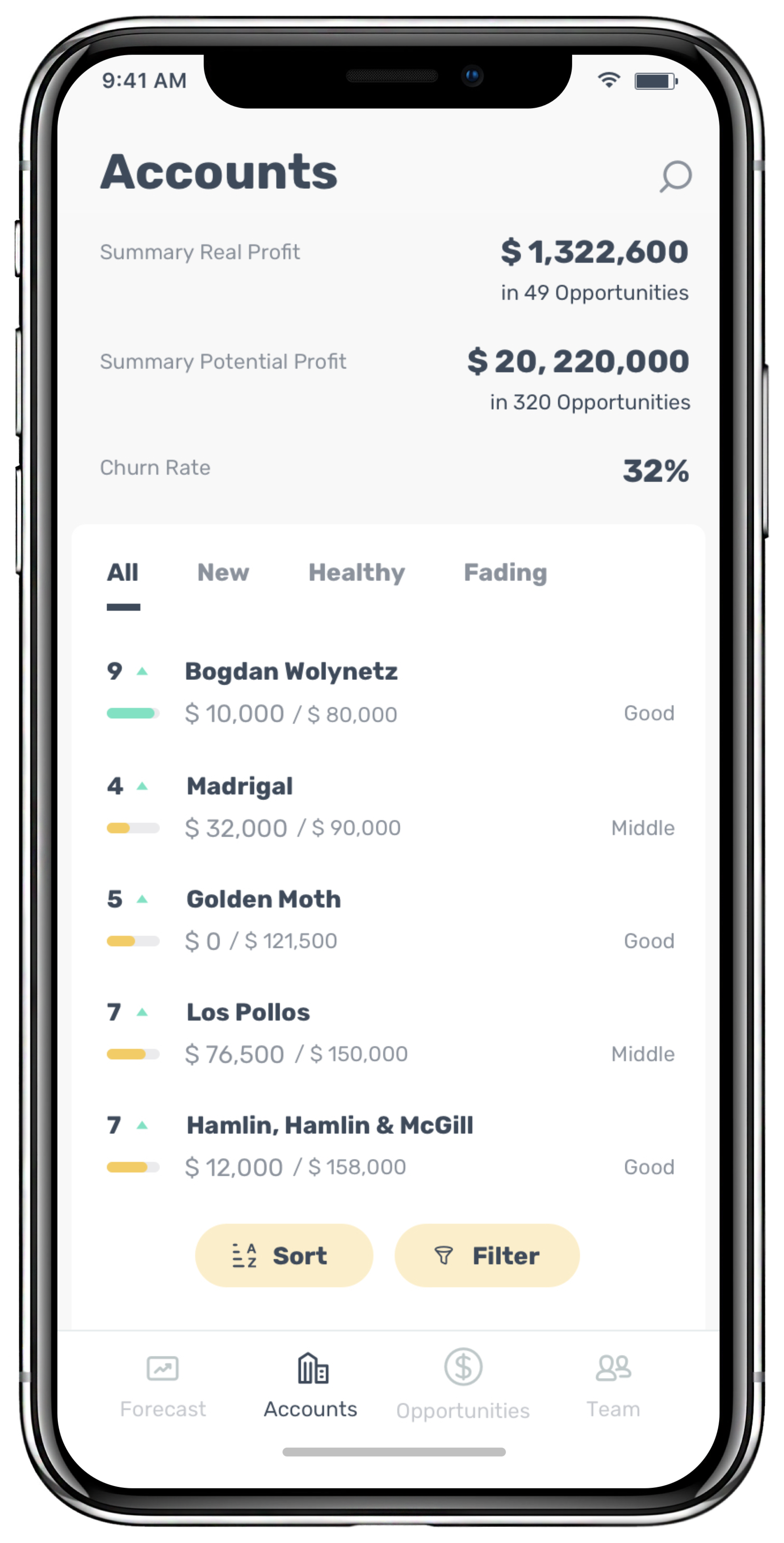
This is home to a vast amount of useful information and metrics that can quickly determine the potential of deals with companies. You can find out the potential annual profit and see companies segmented by Tier.
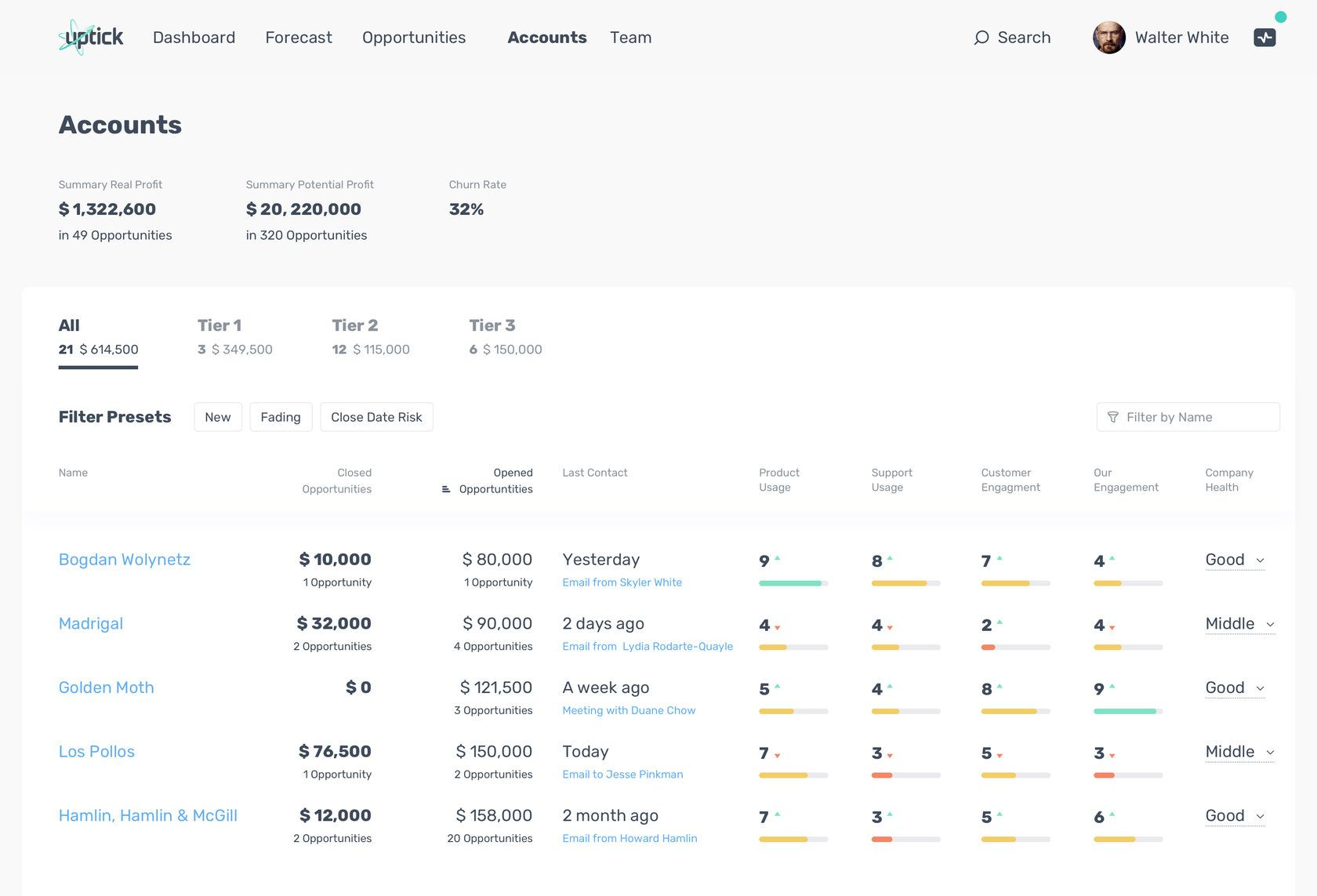
This is home to a vast amount of useful information and metrics that can quickly determine the potential of deals with companies. You can find out the potential annual profit and see companies segmented by Tier.
Filters
Beside the classical Filter by Name we have provided predefine filters which we set on back-end. It's short term decision allow us to solve a big part of user cases while we develop all fields filtering on UI.
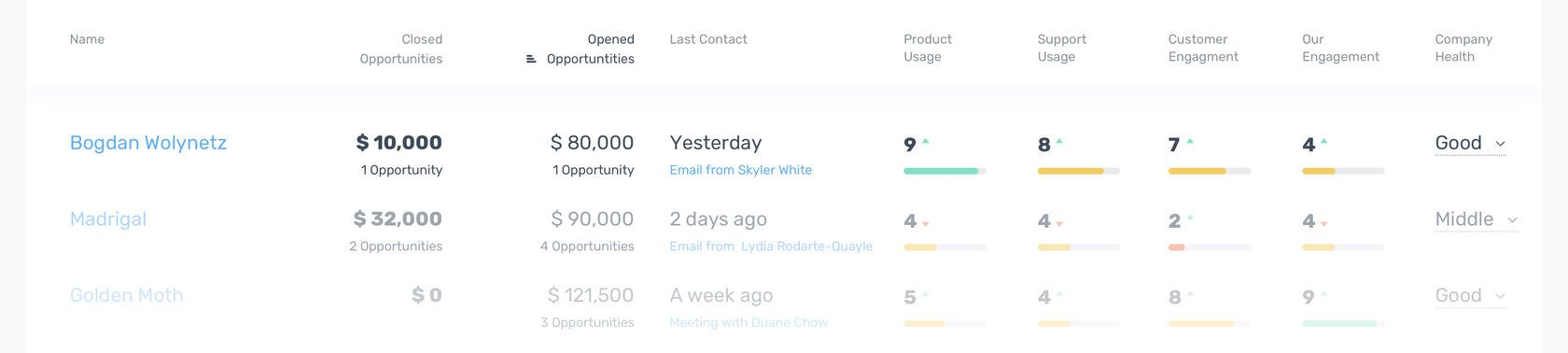
Metrics. There are four company metrics — Product and Support Usage and Our and Customer Engagement. Set of this metrics give to user a picture of deals health. Arrows near the digits showing dynamics of indicator.
Opportunities
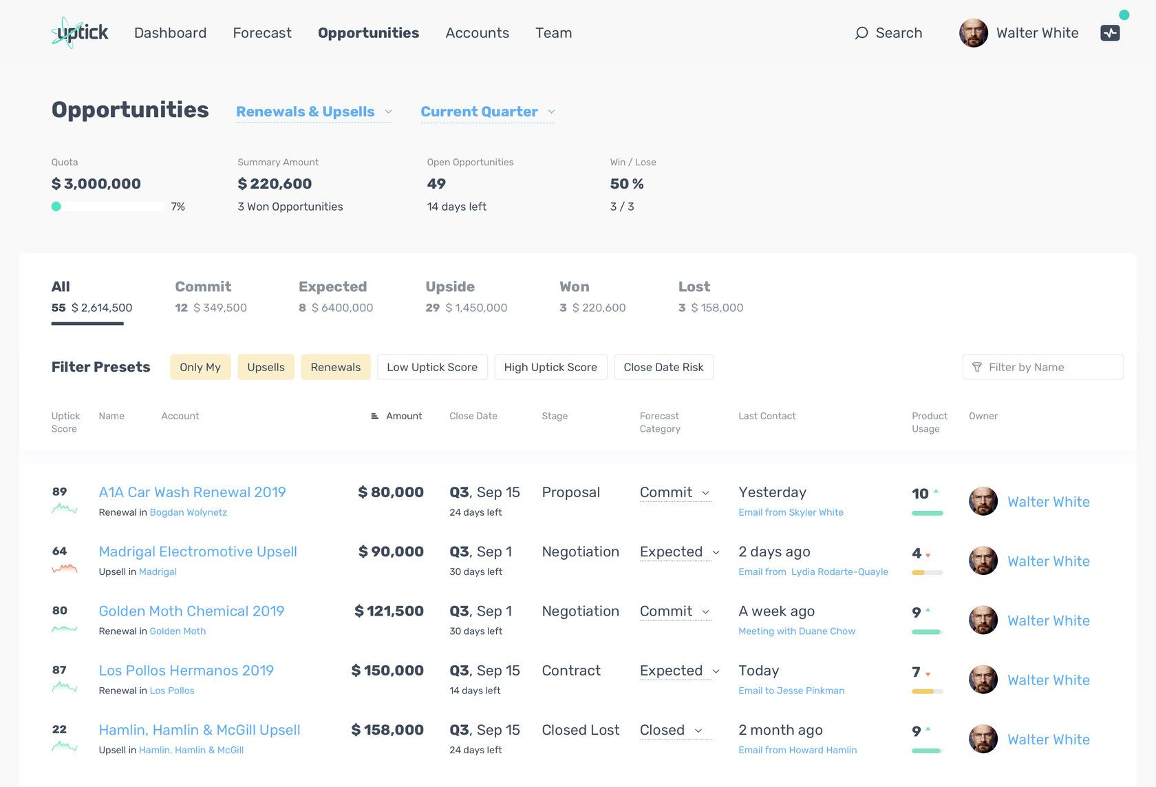
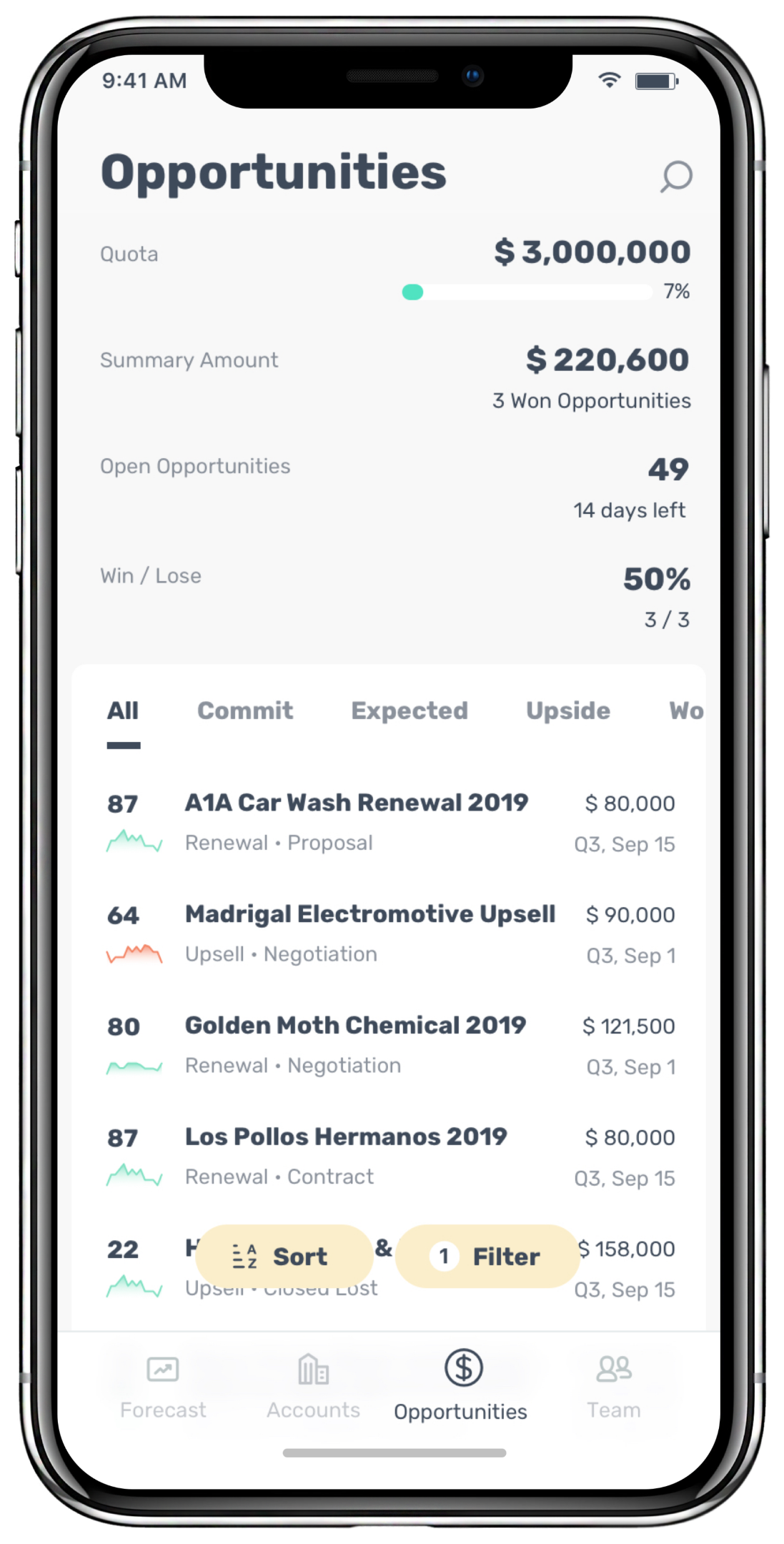
These are directly related to deals. They have their own metrics that create a broader understanding at the company level. Everything is organized and grouped so that sales can quickly assess what actions they need to take to meet their quota and how much time they have left.
This is home to a vast amount of useful information and metrics that can quickly determine the potential of deals with companies. You can find out the potential annual profit and see companies segmented by Tier.
360° Customer View
Problem. Lack of data about Opportunity. Existent data is separated. It's hard for user to see who and when send and receive emails and hold meetings historically in each specific Opportunity.
Solution. So, we have a big chunk of data. We tagged it and divide by buckets. Now our challenge is to give user an instrument which shows sufficient information about Opportunity health. This instrument also called "360° Customer View".
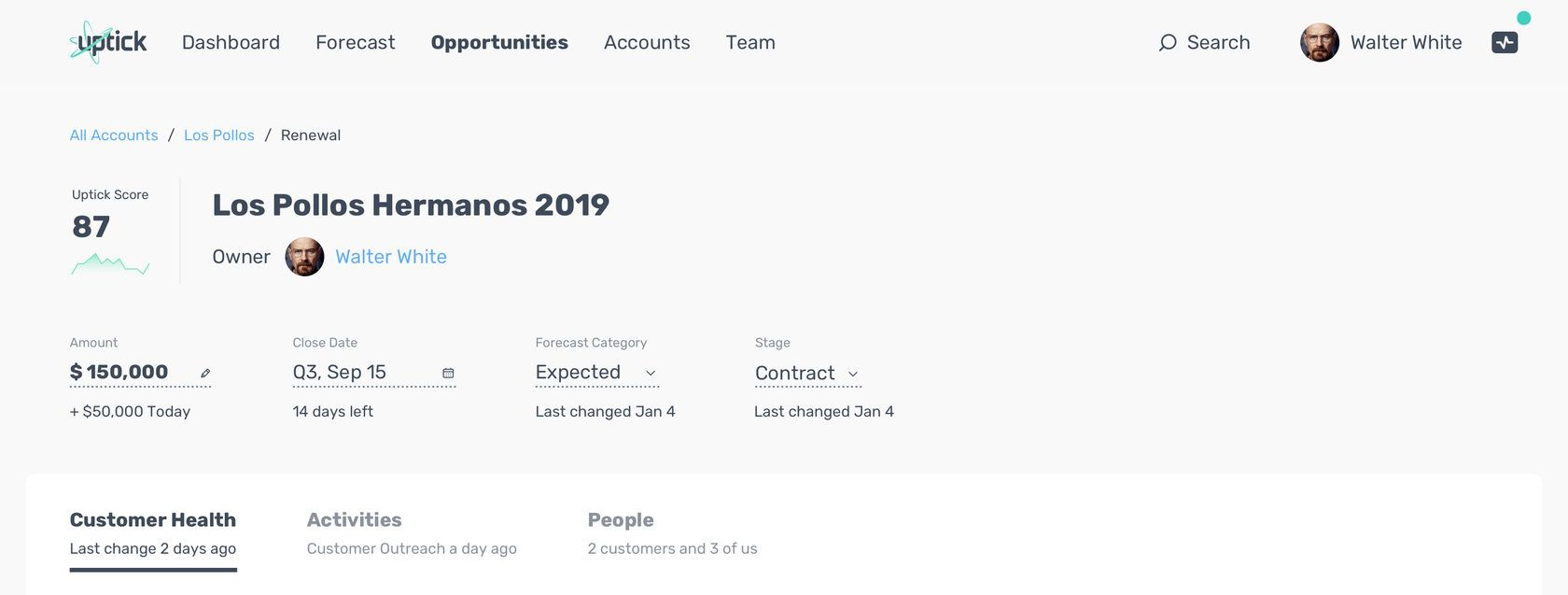
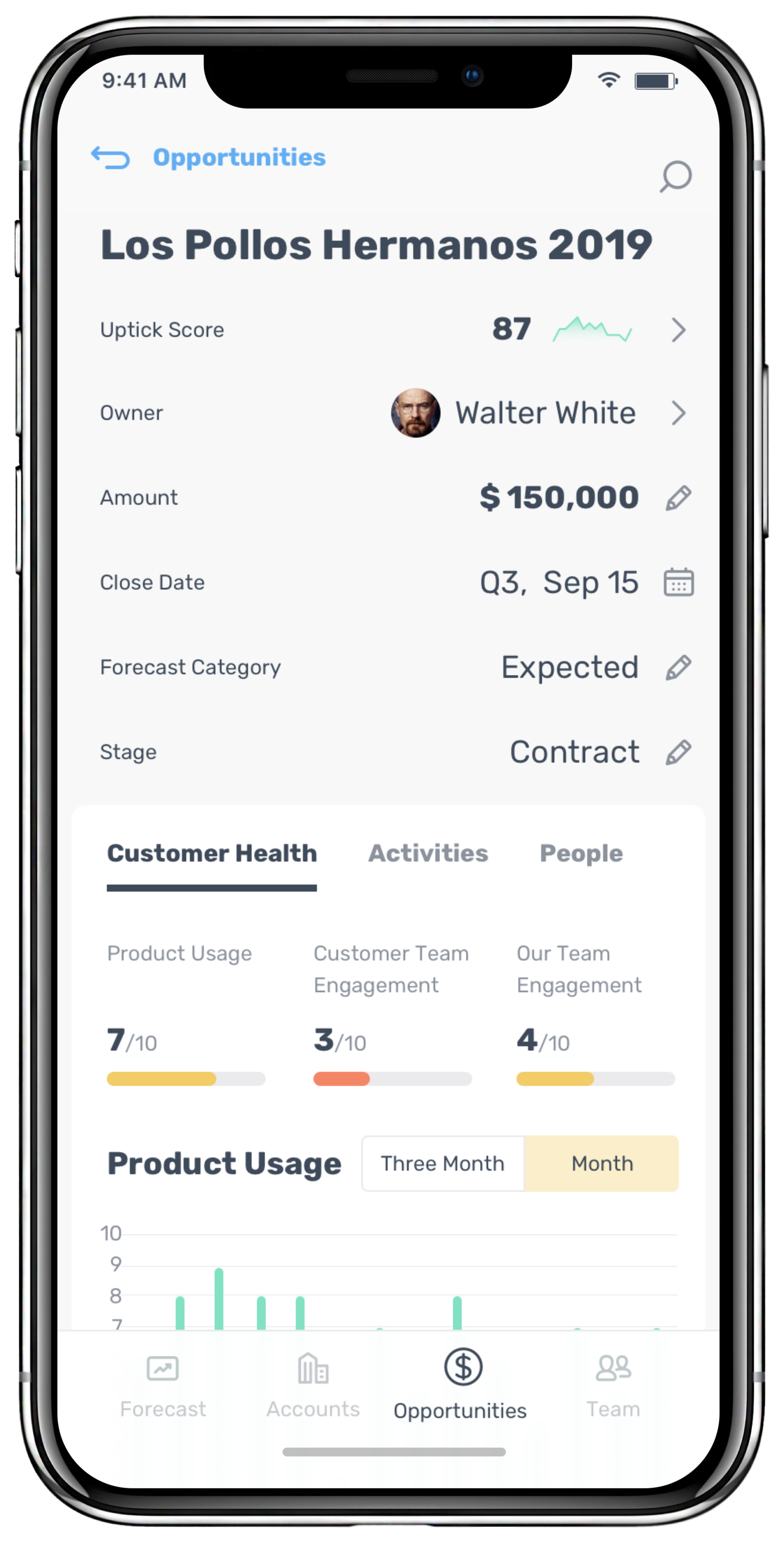
Uptick Score. It is on the left of opportunity name. It is an Uptick interpretation of the opportunity health. Uptick Score ratio is between 1 and 100 where 100 is good health. We get it using a machine learning and it based on a different types of data.
Customer Health
It is a general tab with key metrics of opportunity account.
We try to save user time and put a teasers of metrics right under the tab. This approach allow user to fast scan Product Usage and Engagement to understand opportunity health.
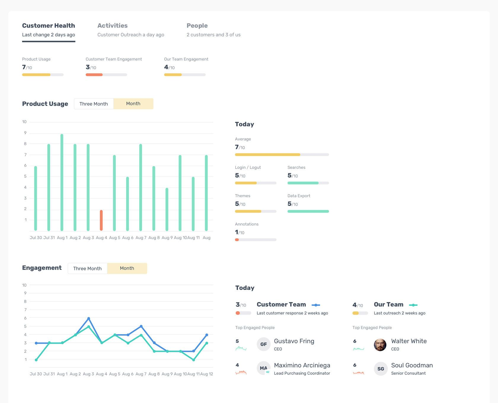
This is home to a vast amount of useful information and metrics that can quickly determine the potential of deals with companies. You can find out the potential annual profit and see companies segmented by Tier.
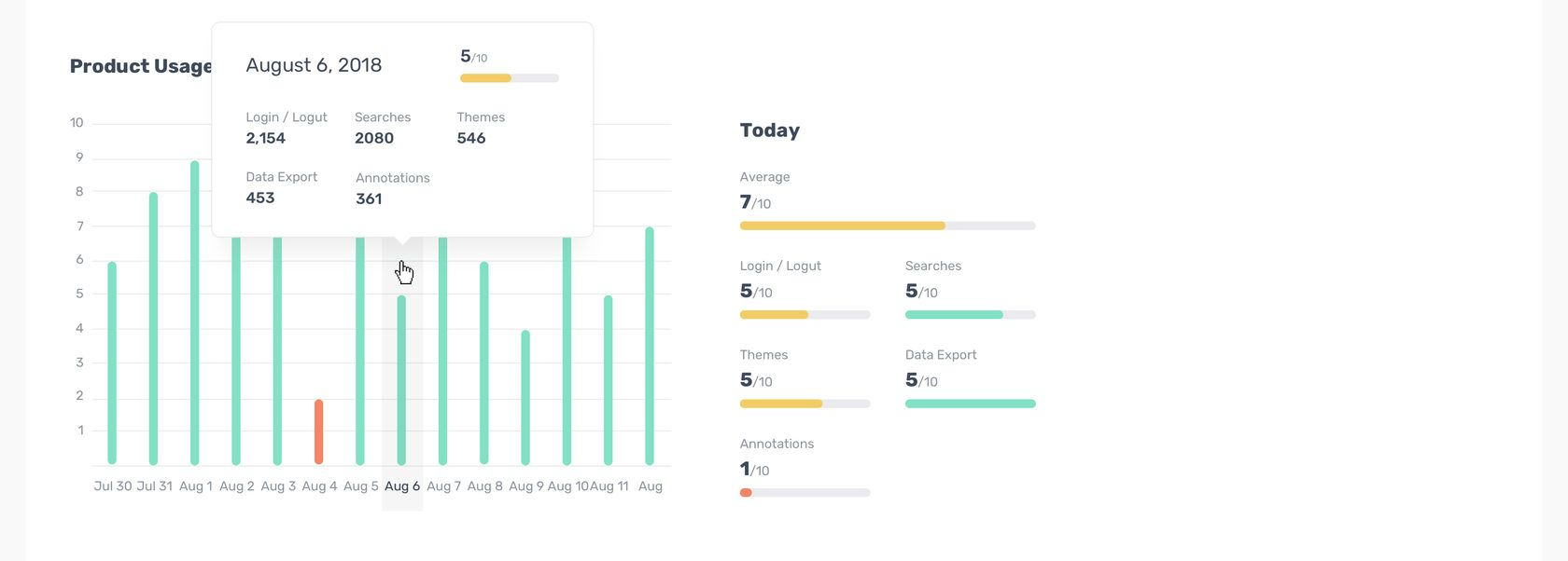
On hover we show detailed numbers for selected day. And we show average indicators on click.
Activities
We have no Search and Filters functional on activities. It was done intentionally. Usually users search emails and meetings in its email clients. The core focus of our timeline is to give context of latest activities.
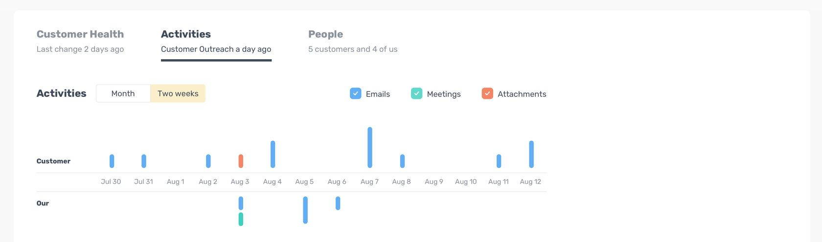
At the top of a Tab we have a segmented bar chart that divided on Customer and Our parts. It's easy to understand what activities was latest and when it was. The more activities per day, then taller bar on chart. If we have different type of activities in a day the bar becomes the segmented bar divided by colors. User can turn on or off activity types using color check boxes and it's affects timeline too.
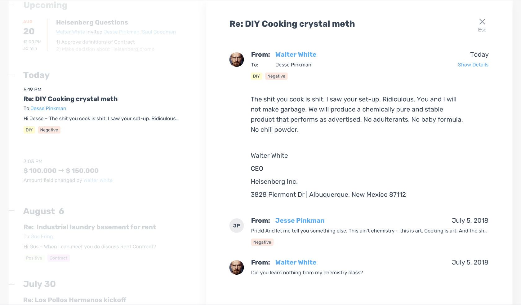
We tagged activities using machine learning. When some of activities appears after each other and with some sequence we can predict, for example, that opportunity's stage is changed and we can tell user about it.
People
All related people we can see on People tab.
To show engagement we use trandline chart. This chart shows the user engagement changes during the time. There are average engagement for team and engagements for each person.
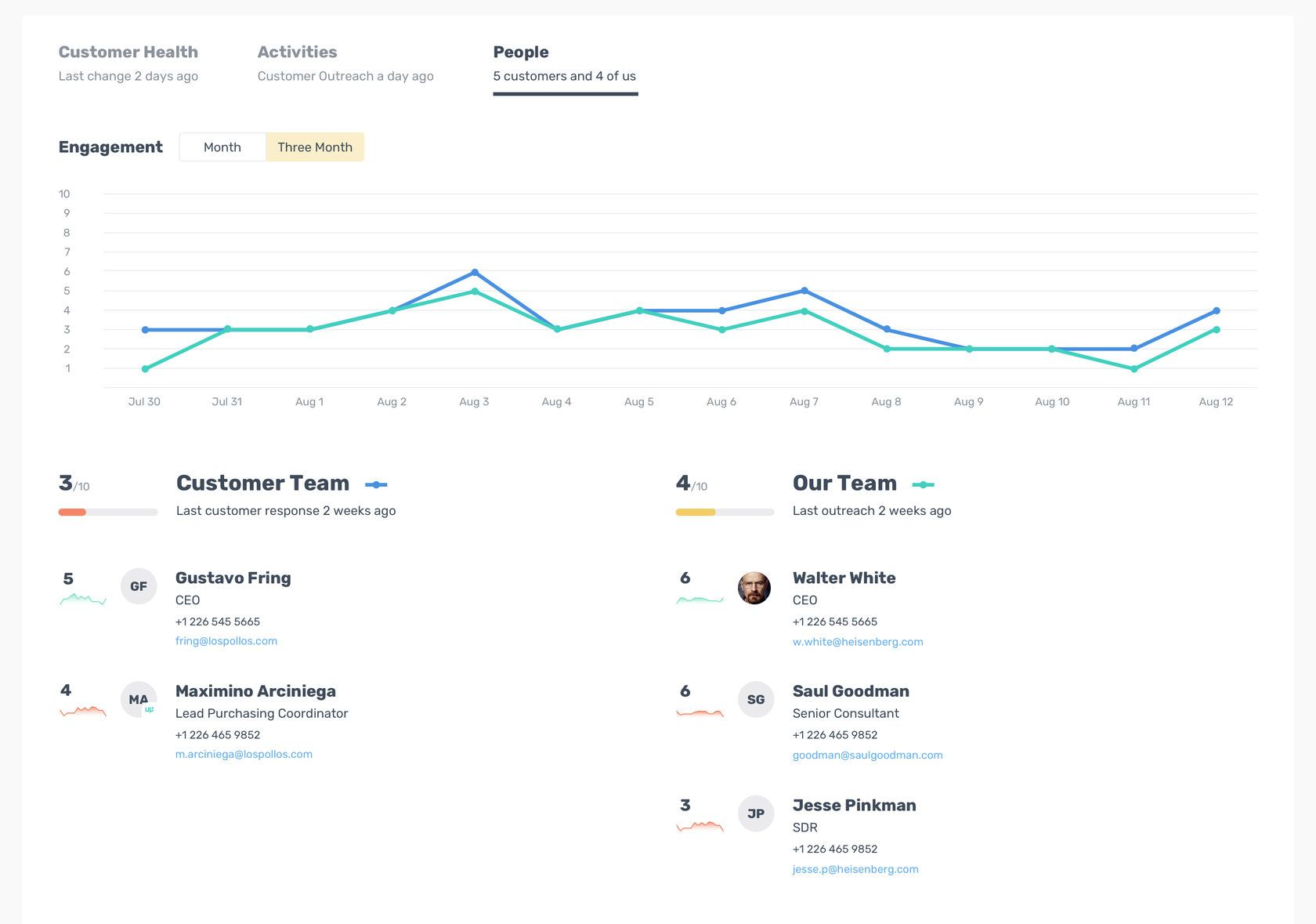
We mark "Up" icon those people who participated in emails and meetings but was not added to the Opportunity. Our system do it automatically. We parse email signatures to know name and title.
Mobile App
We adopted a mobile-first approach, and after testing all our hypotheses and the machine learning functionality, we wrapped the application in a new design. Most salespeople work in the field and rarely visit the office, so the mobile version is very important and necessary for them.

2025 Max Artemyev
Product designer. Crafting digital products since 2015.